Often bad things happen that require new and better design.
national zoo: wyman & cannan
The trail plan, wayfinding and street furniture system was my first project upon joining Lance Wyman and Bill Cannan in 1974. Although I was junior, the team was small and my talents were much sought after and applied. A series of trails, marked at each end with color coded, glazed enamel animal symbols mounted in aggregate cement totems, set the form standard for the benches, water fountains, waste receptacles and park signs. Kids loved following the animal footprints!
The National Zoo project led us to design the furniture, information kiosks, signage, maps, typography and symbols system for Mall in Washington, DC, which won the first Presidential Design Award in 1984.
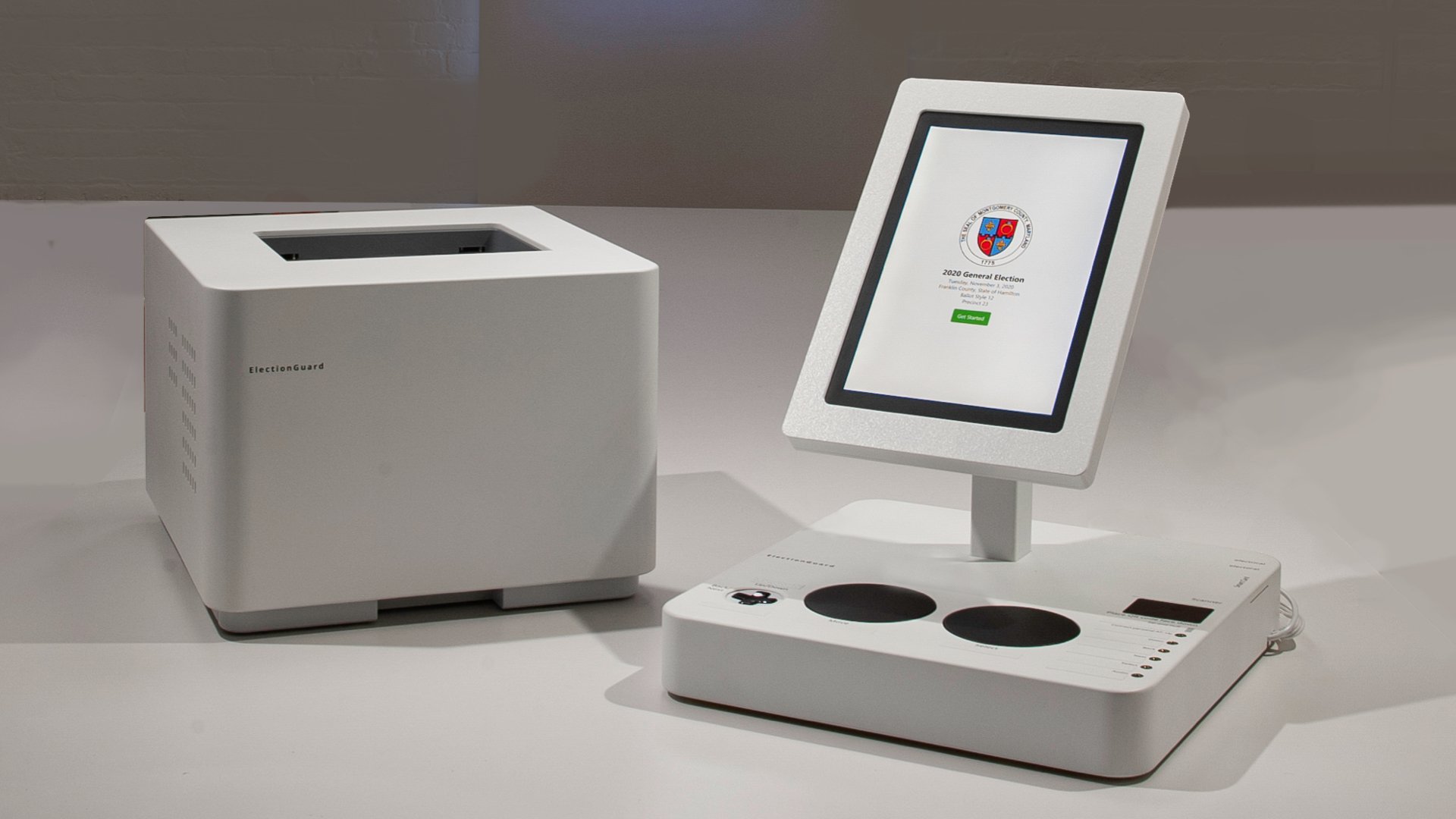
ElectionGuard Voting Machine
The ElectionGuard voting machine with Microsoft’s Defending Democracy Program. The plain design language unifies the elements: a dedicated touch tablet, auxiliary assistive Xbox Adaptive Controller’s big black pads inviting voters to make their vote count.
black & decker toaster: Smart Design
Because this toaster was one of the first of the “blobject” style products it was featured on the cover of the UK Design magazine. When Black and Decker commissioned Smart Design to create on new toaster we explored dozens of forms with styrofoam models.
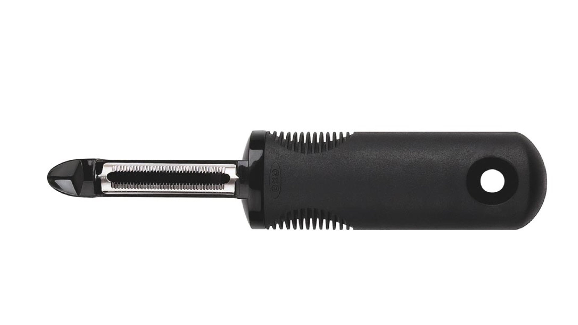
good grips: Smart Design
In 1990, OXO founder Sam Farber’s wife was beginning to suffer from arthritis, so he asked Smart Design to address peeling vegetables. Noted gerontologist Patricia Moore helped sensitize us to older people’s physical abilities, which led me to ask, “Why not design beautiful things for old people that work better for everyone?” Lead by Davin Stowell, the team isolated the two needs: squeezing and holding functions.
Now a transgenerational icon, OXO Good Grips kitchen tools have transformed the housewares industry and are in the permanent collections of many museums, including the Museum of Modern Art, and received the highest awards from the Industrial Designers Society of America, the National Design Museum and the Tylenol Arthritis Foundation.
device: Springtime-USA
Exploration of wearable computing, use the flexible screen or automatically routes your messages, calls or data to the nearest land phone or screen commissioned by Wired magazine.
Carbon Foot
Shenzhen Science and Technology Museum lobby installation proposal. Climate themed performance (theatrical drones printing a foot) in 4 parts: 1) extractors scrub carbon scrubbed from air, 2) made into carbon cement, 3) 3D printing drones 4) creating giant carbon foot. With Jet, wHY, and KCA.
remington hair dryer: Smart Design
After exploring ergonomics and user needs, we created a snappy form language that expressed the function and was translated across the line.
elements of design: rowena fund
I produced and designed Elements of Design to collect and record the curriculum that Rowena Reed, Alexander Kostellow and Donald Donner developed at Pratt – so that future generations could explore the 3-D design exercises.
phone implant: Razorfish
Imagine what it would be like to have your cell phone surgically implanted behind your ear. This concept developed at Razorfish explored interface possibilities as well as public reactions.
library project: robin hood foundation
One of my most rewarding projects was the library I designed with Henry Myerberg for a New York City magnet school called “Beginning with Children.” With Lonnie Tanner’s effort, the project grew into the New York Board of Education’s L!brary Initiative. In our first L!brary, we designed a frieze echoing the skyline made from amazing poems written by the students with the aide of a special facilitator retained by The Robin Hood Foundation. We designed desks and shelves. So far more than $40 million dollars have been donated and more than 30 L!braries have been built
Color Cubes
A series of NFT’s based on Viemeister’s colored cube project extend abstract color exercises derived from Paul Klee’s Bauhaus exercise. Viemeister Industries’ lab developed an algorithm that creates the blocks and color choices automatically, certifying that each piece is unique.
beverage: rockwell group
This huge remote control was for the Red Lounge developed by Rockwell Group for Coca-Cola. Idea was to give teens control of the media but discourage them from walking away with the hardware.
HyperloopTT
Re-packaging a spring and battery toy to promote HyperloopTT’s massive infrastructure project. The surprising and magical toy is part of merchandise campaign expressing tech and speed, including a book of short stories to read on a short fast hyperloop journey and t-shirts that say “FAST”.
venice biennale: rockwell Lab
The interactive experience, Hall of Fragments installation at the Venice Biennale that projected clips from iconic movies turning them into a kinetic web of fragments with an audio soundtrack that reacted to the movements of visitors. Behind the screens, visitors could watch the unaltered films on a sea of monitors. Every moment was unique.
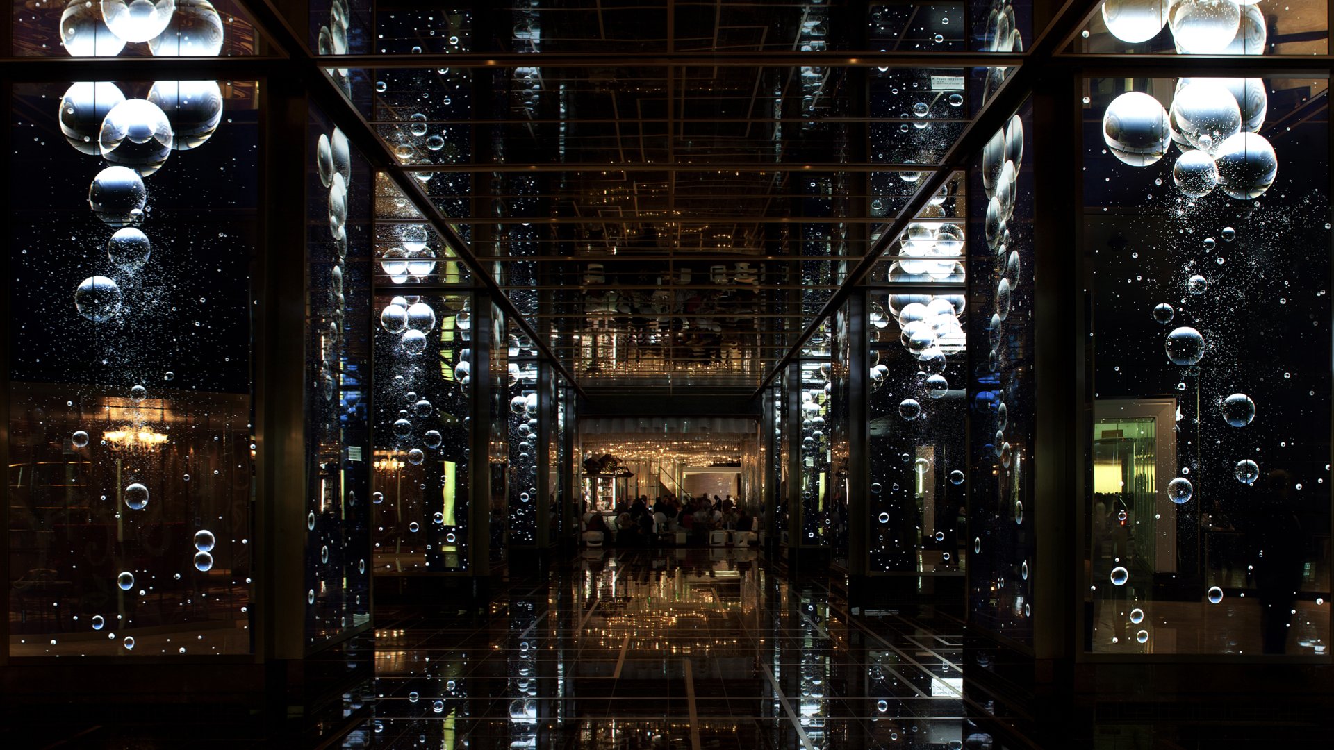
cosmopolitan casino: rockwell group
The Cosmopolitan casino’s digital kinetic lobby space is spectacular. With eight giant central columns wrapped with 384 HD LCD screens covered with 2-way mirrors. The Lab at Rockwell’s computational motion graphics of leaves, bubbles, and flowers or live-action dancers create an immersive experiences. We wrote new environmental choreography software to synchronize all the hardware. We built the platform in a way that other artists can also easily present their own shows on the unique environment.
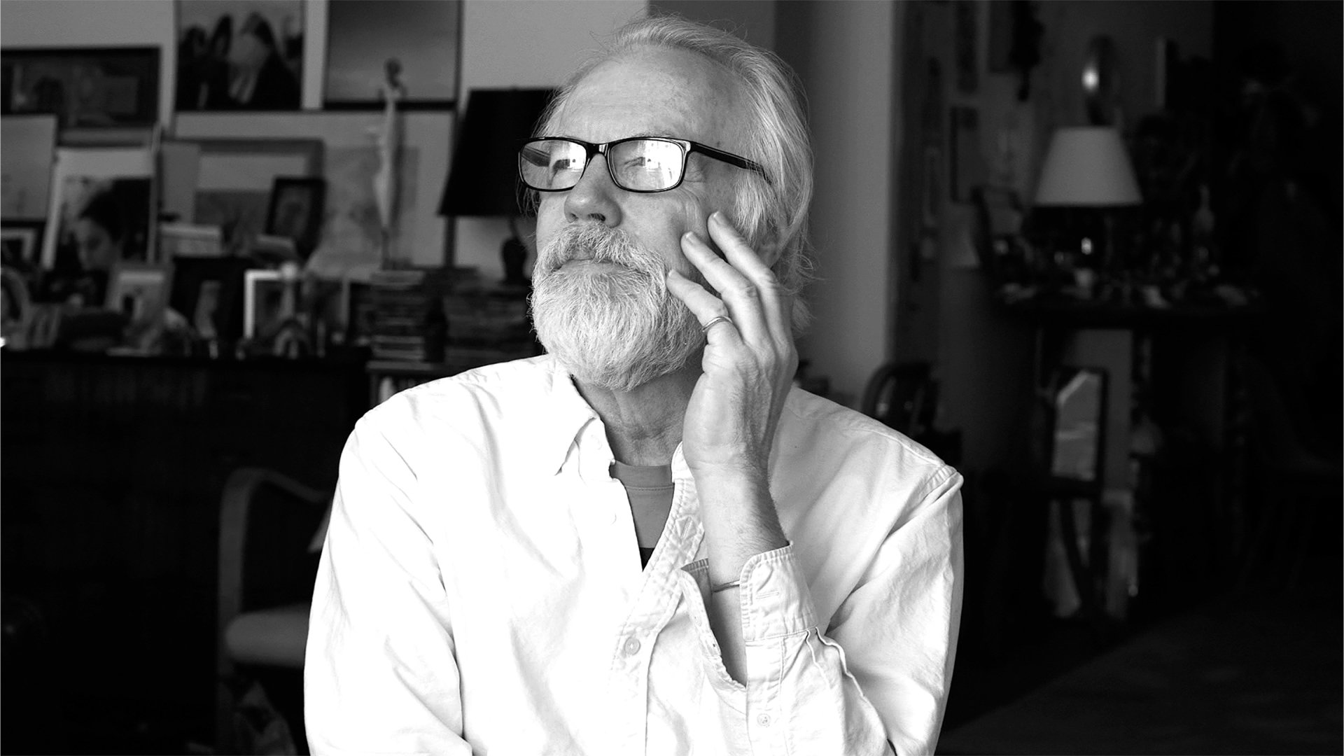
Tucker Viemeister: A Short Film By Ned Myerberg
I became a designer because it’s the best way to “win some victory for humanity.” My life is a convergence of form and content. Born into industrial design (my father named me after the car he designed), I naturally make things from toasters to trucks. I’ve lead groups to create outstanding, fun and profitable environments and products as a founder of
Smart Design
, by opening
frogdesign’s
New York office, establishing
Razorfish’s
physical design capability group, by developing
Springtime-USA
, and as Lab Chief at
Rockwell Group
, built interactive experiences.
I design stuff: consumer products, transportation, architecture, digital interactive responsive experiences, graphics, branding and strategy. I’ve designed cookware and sunglasses for Corning, street furniture for the National Zoo, internet appliances for Google, a mobile kitchen/classroom for Jamie Oliver, and in the beginning, jewelry. Clients include
Apple, Coca-Cola, Cuisinart, Black & Decker, Remington, OXO, Viking, J&J, Timex, Levi’s, Phat Farm, Nestlé, Unilever, Motorola, Toshiba, Sharp, Seibu, Toyota, Nike, Knoll, Steelcase, Kate Spade, Cosmopolitan Casino, Yotel, and the NYC Board of Education.
For more information please contact info@tuckerviemeister.com